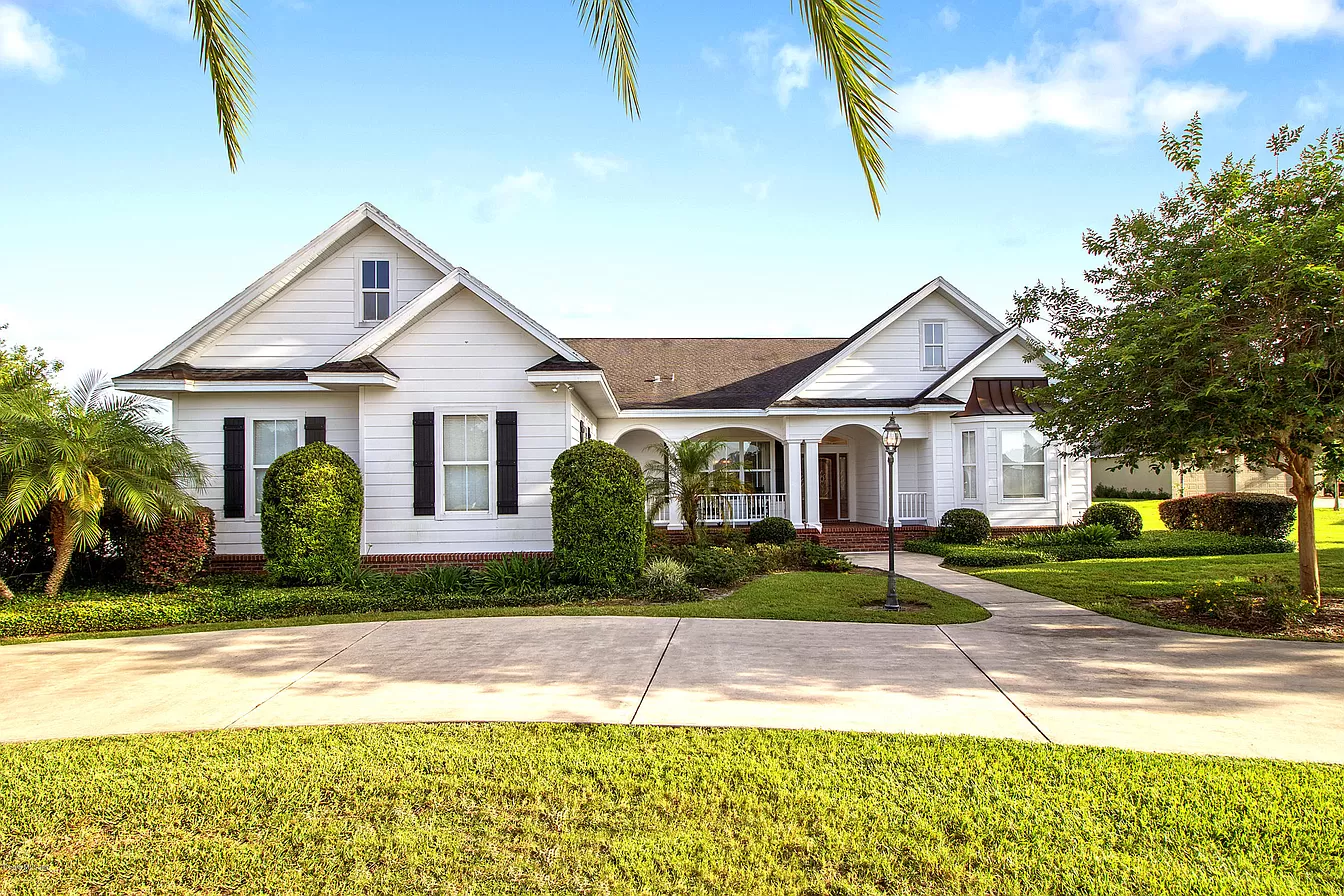
Choosing the right colors for your exterior house painting project can make the difference between a showstopper and a head-scratcher. Many homeowners want to enhance their curb appeal with something unique, and the best color combinations for two-tone exteriors are a great place to start.
But how do you choose the right palette and use it effectively?
In this guide, we’ll walk you through everything you need to know to confidently plan and execute a two-tone paint job on your home’s exterior.
- Two-tone exteriors create visual interest and boost curb appeal.
- Smart color pairing can highlight architectural features.
- Neutral bases with bold accents are trending.
- Test swatches in natural light before making a final decision.
- Use quality exterior paints for lasting results.

Two-tone painting means using two distinct colors on your home’s exterior. Typically, one is a base color, and the other is used for trim, shutters, doors, or architectural highlights. It’s a simple concept with dramatic results when done well.
Two-tone exteriors are more than just trendy—they allow you to personalize your home while also making it stand out in the neighborhood. The right color combo can:
- Accentuate unique architectural details
- Break up large surfaces visually
- Add a layer of sophistication and depth
Let’s get into the meat of it. What works?
This timeless combo screams clean and coastal. Use navy for the base and white for the trim, or flip it for a brighter feel. It works especially well for Cape Cod, Colonial, or beach-style homes. The contrast is sharp, but not overpowering, offering elegance and simplicity in one package.
Perfect for traditional or ranch-style homes, this combo feels cozy and welcoming. Taupe on the body with creamy trim adds elegance without being boring. The softer tones also blend nicely into natural surroundings, making it ideal for wooded or suburban lots.
Feeling bold? Go charcoal on the base with a red door and trim accents. It’s edgy yet still inviting. This pairing works great for Craftsman or contemporary homes, giving them a modern twist with just the right touch of drama. Make sure to choose a warm red, like brick or cranberry, to avoid clashing with the dark base.
Nature-inspired combos are always a win. Sage pairs beautifully with warm whites for a grounded, earthy vibe. This combination suits cottages and bungalows especially well and looks gorgeous surrounded by greenery or stone landscaping. It’s calming, timeless, and eco-chic.
Modern farmhouse fans love this look. Use black on the body and let wood accents shine on doors or beams. It creates a bold, high-contrast aesthetic that feels current and upscale. Consider cedar or oak finishes for the wood elements to bring warmth and texture to the exterior.
Here are some tried-and-true tips to help your project go smoothly:
- Plan your palette: Consider your roof color, landscaping, and neighboring homes. These elements create the visual context for your exterior, so your color choices should complement, not clash with, what’s already present. For example, a gray roof pairs beautifully with cool tones like blues or greens, while a red brick path may work better with warm earthy shades.
- Use the 60-30-10 rule: 60% dominant color, 30% secondary, 10% accent. This guideline helps you maintain balance and visual harmony. The dominant color should be used on the largest areas (like siding), the secondary color on trim and smaller features, and the accent color for doors, shutters, or architectural details.
- Test in natural light: Paint swatches on the exterior and view them throughout the day. Lighting can significantly change how a color appears. A shade that looks great at noon might feel dull or harsh at sunset. Always test at different times to see the full effect.
- Prep the surface well: Clean, scrape, and prime before you paint. This ensures better paint adhesion and durability. Skipping prep work can lead to peeling, bubbling, or uneven coverage—issues that can be costly to fix.
- Choose high-quality exterior paint: This isn’t the place to cut corners. Premium paints offer better coverage, weather resistance, and color retention. Look for brands known for durability and those formulated specifically for exterior use in your climate.

Even with the best intentions, there are a few pitfalls to avoid:
- Choosing colors that clash with your roof or brickwork: Your roof, brick, or stonework are permanent fixtures that should harmonize with your paint choices. Ignoring these elements can make your home look disjointed or chaotic. Always take these materials into account when selecting your color scheme.
- Going too bold without balance: Bold colors can make a strong statement, but if they aren’t balanced with neutrals or complementary tones, they can easily overwhelm your home’s design. Use vibrant hues as accents rather than for large surfaces unless you’re confident in the aesthetic.
- Ignoring how colors look in different lighting: A color that looks soft and inviting in the paint store could appear harsh or washed out in natural sunlight. Test swatches on all sides of your house and observe them at different times of day to get a true read.
- Skipping the primer or prep steps: Proper preparation is essential for a long-lasting paint job. Cleaning, scraping, sanding, and priming ensure that the paint adheres well and looks smooth. Skipping these steps can lead to premature peeling, uneven application, and a generally unprofessional finish.
Need ideas? Check out:
- Pinterest boards for modern farmhouse or coastal homes
- Neighborhoods with historic charm
- Paint brand websites with interactive color tools
If ladders, sanding, or color theory make you nervous, it’s totally okay to hire a professional painter. They can offer expert guidance on color choices and ensure your finish lasts.
At Make It Happen Painting, we specialize in bringing your dream exterior to life. Whether you need help choosing the best color combinations for two-tone exteriors or just want a flawless finish, we’re here to help. Contact us today at 352-309-3999 for a free consultation!